Showing posts with label essie. Show all posts

Sunday, February 12, 2012

Comparison: Revlon Posh VS. Essie Pretty Edgy

Finally! I was able to get some decent pictures of Essie Pretty Edgy (Summer 2010 collection) next to Revlon Posh (and a comparison with CND Green Scene will be up tomorrow, which is definitely not a dupe.) We've had some dreary weather (overcast, rain and then snow!) here in DC after so many incredibly beautiful days, but we had a few hours of sunshine and I was able to take comparison shots.
These are the bottles side-by-side, in the bottle I can't tell much difference between the two. Both are medium leafy-greens.


On the nail the difference is extremely subtle, too. See for yourself: Pretty Edgy is a bit lighter, and Posh might have a drop more yellow (maybe? In some lights.) The formulas are even extremely similar. I can barely tell them apart! 3 coats of each in these pictures, and no basecoat or topcoat.

Sunlight
Flash

Closeup: Sunshine
 
Flash


 Price:
  • Revlon $4-5 but it's easy to find a coupon or a sale, I paid only $2.50 (Walgreens, Rite Aid, grocers & drugstores, Drugstore.com)
  • Essie $8 (Ulta, Head2Toe Beauty, Amazon) (Pretty Edgy is not part of the Essie selection available in mass retailers and drugstores)
Application, Formula & Bottle:
  • Revlon's bottles are tapered glass with a round base and a long, round, black cap with a flat top, and gold accents. The bottles look a bit dated to me, but they aren't so bad (the new ColorStay bottles are much sleeker, though.) The cap is tall, but comfortable to hold though it can be slippery because of its glossy plastic finish. The stem is on the longer side too, and the brush is long, flexible, and of medium width and narrow thickness. It can seem a little floppy because of the longer length and it could be a tad denser as well. Posh's formula is a nice squishy creme--the pigmentation isn't intense but it covers well in 3 thin coats and dries with a nice shine without topcoat. Application was fine, the brush didn't cause me any problems or dragging. Bonus: No staining with removal!
  • Essie has the cutest bottles, square glass embossed with "essie" on 2 sides. They have a white plastic cap, on the shorter side, with a medium-length stem. The cap is smaller and has a slick shiny finish, so I have to mind that I keep a good hold of it as it can be slippery and easier to drop or fumble. The brush is petite and thin and flexible. I like Essie's brush because it makes it easy for me to control & position the polish just where I want it. Pretty Edgy has Essie's typical creme formula: somewhere in between a jelly and a creme. The finish is shiny without topcoat, and on the translucent side but it is fully opaque in 3 thin coats. Application was easy with no dragging as long as I was patient between coats. Bonus: No staining with removal!
Cruelty/Animal Testing:
  • Revlon is certified by PETA as a company that does not test on animals, and their publicly available information says that their ingredient and component suppliers do not perform animal testing on the materials.
  • Essie themselves do not test on animals; however, their parent company L'Oreal (the guys who own them) does test on animals. This is what I consider a gray area in terms of how to vote no-cruelty with polish dollars.
Final Thoughts:
  • Revlon Posh looks like a perfect cheaper substitution for Essie Pretty Edgy. They are very, very nearly dupes - I don't even know if I can tell the difference, and the formulas are extremely similar too. Posh is easier to find, as well. I do like the Essie bottle better but not $5 better! I myself prefer the animal testing policy of Revlon overall as a company too. Even as a lover of greens I can't find a reason to keep both!

Sunday, February 5, 2012

Essie Go Overboard comparison: from the Spring 2012 mini-collection

Here is the last of the Essie Go Overbord mini-collection comparisons, the collection's namesake. Go Overboard is a deep teal creme, what I would call in the "peacock" family- I don't know why but that's how I think of these deep rich green-blues.
I expected to have an easy dupe in my stash because I have so many of these "peacock" shades, but surprisingly nothing was all that close except for Color Club Gossip Column, which is a cousin but no dupe. Gossip Column is significantly bluer, and it is a couple shades lighter- not neccessarily brighter, because Gossip Column has a dusty quality to it. Go Overboard isn't dusty, just deep and rich.
Some others which didn't match up: Barielle A Bouquet for Ava is too light, and Finger Paints To-Teally Chic is too light and dusty, and Orly Sapphire Silk is too gray. Illamasqua Muse is too light, RBL Teal is too dark, Orly Calpyso Breeze is too blue.
Here are side-by-side comparison pictures. 3 thin coats of each. (A bit sloppy swatch because I was trying to catch the last of the day's sunlight!)

Sunlight
Sunlight
(terrible) Flash, indoors

Price:
  • Essie $8 (drugstores, Ulta, head2toebeauty.com, amazon.com)
  • Color Club $3 (head2toebeauty.com, 8ty8beauty.com)
Application, Formula, Bottle:
  • Essie has the cutest bottles, square glass embossed with "essie" on 2 sides. They have a white plastic cap, on the shorter side, with a medium-length stem. The brush is petite and thin and flexible. I like Essie's brush because it makes it easier for me to control & position the polish just where I want it. Go Overboard is a really great creme; it is smooth and pigmented and opaque: a one-and-a-half coater. (The pictures have 3 because I'm a habitual 3-coater.) Unlike Essie's usual squishy jelly-cremes (which I love,) this one is a really creamy creme with a dense finish, and I really like it! Bonus: No staining! I expect & fear staining and smurf-fingers from well-pigmented blues/greens, but this one came off without any of that.
  • Color Club has a bottle, brush and handle I love. The bottle is square glass, and the medium-heighth cap is matte black plastic and a good width. The stem is medium-length. I really like Color Club's brush--to me it is almost the best of all brushes, especially for my petite nail-beds. It's medium-length, good density, flexible, but with enough resistance so it's not floppy; it fans out well for a neat cuticle line and also helps me place & manipulate the lacquer easily. Gossip Column is also from a spring collection (Rebel Debutante, 2010.) It is smooth and easy to apply with a nice shiny finish, 2 coats to opacity. Bonus: No staining from this one either!
Cruelty/Animal Testing:
  • Essie themselves do not test on animals; however, their parent company L'Oreal (the guys who own them) does test on animals. This is what I consider a gray area in terms of how to vote no-cruelty with polish dollars.
  • Color Club and their parent company Forsythe Cosmetics both do NOT perform animal testing! I believe that many of Color Club's lacquers are vegan, too.
Final Thoughts:
  • If you already own Color Club Gossip Column you could pass by Go Overboard if you're just looking for a chic deep teal for spring. If you don't already own either of these, like the look of the Essie and are looking to conserve your polish dollars Gossip Column is much cheaper, makes a decent subsitute in terms of color, and it has a good formula too. If you are a lover of these peacock shades, however, you may want to snap up the Essie as it has a great formula.
  •  I'd like to see Go Overboard next to NYX Girls Indigo Blue and OPI Ski Teal We Drop (which are no longer in my stash) but I think both of them might be bluer than the Essie--but if I still had Ski Teal We Drop, for example, I think that I'd probably choose to skip Go Overboard.

Essie Play Date comparison: from the Go Overboard Spring 2012 mini-collection

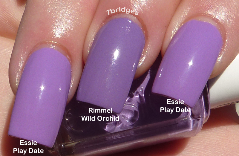
Today I have the second of 3 posts with comparisons from the Essie Go Overboard mini-collection, Essie Play Date! Play Date is a light pinky-purple creme, along the lines of what I think of as the "orchid" color family. From promo shots I thought Play Date would be similar to OPI Panda-monium Pink, Nubar Isis Purple, something along those lines, but those are way, way too pink and not even close. Play Date is much closer to an actual purple shade, and it is a little darker than I thought too.
Here is a bottle-lineup to show where Play Date falls against some other colors in my stash. I included Spontaneous because it's a commonly-owned color and not that far off, and then Essie Nice is Nice as a reference.

The closest polish in my stash ended up being Rimmel Wild Orchid. Wild Orchid is a sister in the orchid family to Play Date but no dupe. Wild Orchid is cooler and a shade darker. Here are comparison pictures. 3 coats of each, no basecoat and no topcoat.

Sunlight

Sunlight


 Indoors with flash (sorry, still getting the hang of flash!)


Price:
  • Essie $8 (drugstores, Ulta, head2toebeauty.com)
  • Rimmel $3-4 (drugstores, Ulta, amazon.com)
Application, Formula & Bottle:
  • Essie has the cutest bottles, square glass embossed with "essie" on 2 sides. They have a white plastic cap, on the shorter side, with a medium-length stem. The brush is petite and thin and flexible. I like Essie's brush because it makes it easier for me to control & position the polish just where I want it. Play Date's formula was average, not streaky, and has a bit of that squishy jelly-creme quality that I have come to expect from Essie. It wasn't super-pigmented but it applied nicely in 3 thin coats and dried pretty shiny.
  • Rimmel's bottles are square glass, just like the old Sally Hansen Salon bottles, and I like their shape & feel. The cap is tapered shiny black plastic, with a medium-length stem. The brush is kind of like a Sally Hansen Insta-Dri/CSM crossed with an OPI Pro-Wide or something. It is paddle-like, flat and wide, with a rounded end, pliable but with some resistance. I liked this brush! Weird considering I don't usually like these brushes.  I have small nail beds, so sometimes these can be hard to control. This brush did a good job at making a nice neat cuticle line without being sloppy and applying the right amount of polish for an even coat. However, because of its size and firmness it can cause dragging if you don't wait long enough between coats. Wild Orchid's formula was opaque and medium-thickness, pigmented but not globby. It went on great with no streaks or problems, and it is opaque in 2 coats though I did 3 for uniformity. It dried less shiny than the Essie, a little more of a satin finish.
Cruelty/Animal Testing:
  • Both Essie & Rimmel are owned by companies who perform animal testing, but Essie and Rimmel both assert that they do not test on animals themselves. This is what I consider a gray area in terms of how to vote no-cruelty with polish dollars.
Final Thoughts:
  • I love purples but these pink-y orchid-tones often clash with my NC20 skintone. Play Date and Wild Orchid are different enough to own both, especially if you really like these pinky-purple shades. I will probably just keep Wild Orchid, because it's cooler-toned and doesn't make my hands look as red as Play Date (ha) and I prefer the formula.
  • If you are just looking for something close to the Essie for a cute spring color, Rimmel Wild Orchid is a great polish for a lot cheaper. If you're really coveting Play Date, I don't know if Wild Orchid will cut it.

Saturday, February 4, 2012

Essie Armed & Ready comparison: from the Go Overboard Spring 2012 mini-collection

I recently was gifted the Essie Spring mini-collection, Go Overboard. (Thanks Sophie!) It consists of 3 polishes: Go Overboard (a deep teal-blue creme), Play Date (a light orchid-lilac creme) and Armed & Ready (a gray with gold-pink shimmer.) I have searched through my stash for similar polishes, and taken comparison shots for each!

Today we have Essie Armed & Ready. This polish has a creamy, concrete-gray base perhaps with a drop of olive, with gold, pink and copper shimmer, plus little bits that reflect greenish, red and a bit purple in full sun.

I have swatched Armed & Ready with L.A. Girl Disorder AKA Love & Beauty Golden Grey. Disorder has a similarly creamy gray base with a drop of slate-blue, a shade or 2 darker than Armed & Ready and cooler, with the same sort of gold-pink-copper multicolored contrasting shimmer.

A nail-fanatic eye would tell these apart, but no one else. Their basic makeup is the same, but Disorder is a bit darker, cooler and its shimmer is more prominent. From afar, it's hard to tell the difference, and I think Disorder is a great substitute for Armed & Ready for less than half the price!

Shown is 3 thin coats of each (they only really needed 2, but I habitually do 3, I think it brings out the contrasting shimmer better) with no topcoat and no basecoat.
Sunlight
Sunlight
Sunlight
Flash, indoors (sorry, still learning how to take flash pics!)


Price:
  • Essie Armed & Ready $8 (Ulta, Rite Aid, Walgreens, Head2Toe Beauty)
  • L.A. Girl Disorder/Love & Beauty Golden Grey $3 (Cherry Culture, certain supermarkets like Fred Meyer, Forever 21 stores which is where I bought mine)
Application, Formula, Bottle:
  • Essie bottles are just the cutest. They are square glass, with "essie" embossed on 2 sides. They store well in Helmer drawers, and they don't feel flimsy. The cap is shiny-finish white plastic, pretty short, with a medium stem (Zoya-length) and a small brush. I personally love the Essie brush, as I have small nail beds--I find it makes the lacquer easy to place & control, and I rarely need cleanup when I use Essie. The cap can be a little slippery, though. The formula of Armed & Ready was great: opaque and smooth without compromising the golden shimmer. It dried in average time on me, too. (Big 3 Free)
  • L.A Girl/Love & Beauty bottles are nice and sturdy-feeling. They are wide on top and taper down at the bottom, and are flatter instead of round (pic, they are a bit hard for me to describe!) The bottom is thick & weighty in a good way. I like the shape and feel, and how it stands solidly while doing my nails. The medium-sized cap is matte-finish black plastic, and it's tapered a bit like Zoya caps, which provides a comfortable grip for fingers while polishing. The stem is on the shorter side, and the brush is reminiscent of $OPI/old OPI brushes, but it is slightly floppier. The brush didn't cause me any problems, but I had to be careful while polishing up the sides of my nails to avoid getting polish on the skin. The formula of Disorder was great, too: creamy and pigmented but the shimmer still shone through. It dried in average time on me. (Big 3 Free)
Cruelty/Animal Testing:
  • Essie themselves do not test on animals; however, their parent company L'Oreal (the guys who own them) does test on animals. This is what I consider a gray area in terms of how to vote no-cruelty with polish dollars.
  • Beauty21 (L.A. Girl/Love & Beauty's company) is PETA-listed as a no-animal testing company. Hooray!
Final Thoughts:
Myself, I'd rather spend $3 on something quite similar than $8 for the Essie! That gives me a extra $5 toward something extra-unique :)

Comparison: L'Oreal Safari Chic VS Essie Sew Psyched

Good afternoon! Here I have the 2nd of my L'Oreal Safari Chic comparisons. I have placed Safari Chic next to Essie Sew Psyched. Being as L'Oreal is the parent company of Essie, I was fully expecting dupes--and I got what I expected. I can't tell a smidge of difference between the two. 
Shown is 3 thin coats of each (you could easily get by with 2 medium coats) and no topcoat, no basecoat.


The formulas were approximately the same, though the L'Oreal brush is much larger & wider. Application with both was easy, no problems to be noted. So what are the differences between the two polishes? The L'Oreal is $4-5, and the Essie is $8, nearly double the price. If one is only choosing between these 2, I would recommend the Essie as Essie itself does not test on animals, though its parent company does. Plus, I love Essie's bottles & brushes and I think the L'Oreal style is kind of tacky. However, I think that Sonia Kashuk Fatigued is a great choice too- $4-5, cute bottle & good brush, barely distinguishable from either of these two, and from a cruelty-free company. Nice!

Tuesday, January 31, 2012

Comparison: L'Oreal Safari Chic VS Sonia Kashuk Fatigued


Good morning! Today, I have 2 comparisons with L'Oreal Safari Chic. This, the first one, compares it with Sonia Kashuk Fatigued. Safari Chic is one of the new Colour Riche offerings. I borrowed a few of these Colour Riche lacquers to swatch in hopes of finding alternates: L'Oreal is a perpetrator of animal testing. I am always excited to search for alternatives from cruelty-free companies, thus the purpose of these swatches.
I am glad to say that I think that Fatigued is an excellent substitute.
Both are murky, greyed sage greens shot through with subtle shimmer which is unnoticeable except in sunlight. Their shades are approximately the same: I would say that I can't find more than 1/2 shade difference between the two. The shimmer in Fatigued, however, is slightly more prominent, although this difference is only visible in the sun, and even then only slightly.


Application is similar, though I prefer the formula of the Sonia Kashuk. I do think the L'Oreal brush is OK, but the formula is rather thick. 2 coats to opacity, though I did 3.
For clarity's sake I pronounce them very-near dupes. Even if Safari Chic were made by a cruelty-free company I could not justify owning both.

These swatches are 3 coats of each lacquer, no topcoat. Pictures taken in direct sunlight.